

Say no more, I NEED to watch!
Expanding on the shoujo tag, I couldn't believe this was published in Betsucomi (ベツコミ), a monthly Japanese shoujo manga - guess the girls back then were a lot more mature - perhaps less sensitive than the strawberry generation? - than conceivable in the present...
Nearly a year has passed since I stumbled upon this beauty on Mandarake's website, which was a miracle in the figure world as it is impossible to get them (at a reasonable price) once you missed the preorder. Looking back at the Order History, my brows raised at the shipping fee, but nevertheless I applauded myself for the excellent decision:

He has also since become the cover boy of my Mail:
The street features gray flagstones, rows of red lanterns, and I wouldn't be surprised if the spirits of the ancient civilians still resides by this ancient soil. I'll make it a point to locate this alley when I visit China!


#3: Do take note to account for the material's thickness so you can save on some paper when you glue the Styrofoam boards together (In case you're wondering, the wooden bracket attached to the side of the board is for hanging the lanterns - a sudden stroke of idea)

(P.S.: The guns & toning are giving me Gunslinger Girl vibes...)
D3. Behind the Scenes
Expanding on the shoujo tag, I couldn't believe this was published in Betsucomi (ベツコミ), a monthly Japanese shoujo manga - guess the girls back then were a lot more mature - perhaps less sensitive than the strawberry generation? - than conceivable in the present...
Nearly a year has passed since I stumbled upon this beauty on Mandarake's website, which was a miracle in the figure world as it is impossible to get them (at a reasonable price) once you missed the preorder. Looking back at the Order History, my brows raised at the shipping fee, but nevertheless I applauded myself for the excellent decision:


Kotobukiya also released their interpretation based off the above pose in their 1/8 ARTFX J line. I wasn't a fan of the basic outfit, so I gave it a pass:
 |
| Image source: Kotobukiya website |
Now I'm (finally) ready to share my interpretation of Megahouse's scale figure, inspired by the historic Jinli Street (锦里古街), Chendu, Sichuan, dating back to The Qin Dynasty (秦朝, 221 - 207 BC):
 |
| A narrow alley along Jinli Street Image source: Flickr |
I had a headache figuring out how to design the lanterns, but finally settled with a stylised design, rather than model after the actual lantern.
A. Lantern Making:
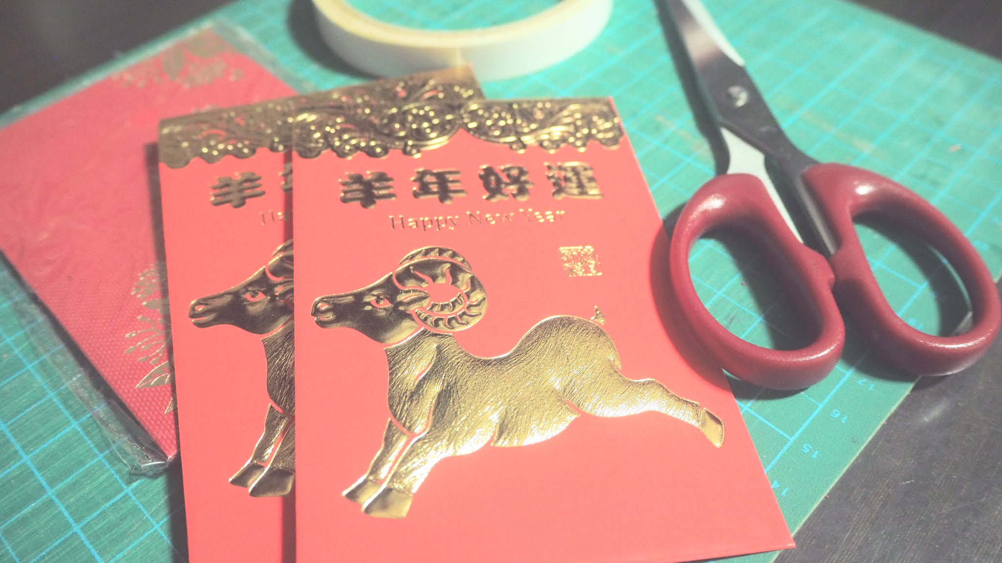
#1. Dig out leftover ang baos (red packets) from past Chinese New Year collections

#2. 'Disassemble' the ang bao, and cut as above
(For the DIY lovers, check out the tutorial here)

#3: Finished product! After making 5, I realised they were too huge... I made another 6 by cutting the ang baos into half

#4: Making the hanging mechanism - this was the reason for the delay in starting this project I had NO IDEA...until I realised I could use floral sticks to string the lanterns together
B. Background:

#1: Sometimes I wonder if I studied Landscape Architecture just so I was enabled to do such 'elevation plans' and photography editing

#2: Nothing like stock images to aid my non-existent CG skills! I initially started with 2 textures (stone cladding & dirty concrete), but decided to add in a door and stone steps to create depth in the backdrop


#4: Elevation of the door & stone steps; added the Emergency Sign as an interest point; arrow aids in guiding the viewer's eye to the subject/desired focus point
C. Reflections
While I'm ashamed to admit I had not touched my Olympus E-PL8 for almost a year, I was not prepared for it to spoil on me! Turns out my lens was no longer sensitive to the camera body and had to be replaced... The good thing is I finally got a dedicated lens for close up subjects - a Sigma DN ⌀46 Fn 2.8 that gives some sick depth of field and bokeh effect!
(Not that I got to try the latter due to the nature of the set [not enough distance between the subject and light source to create the bokeh effect...])
Total damage plus the filter lens (after a generous discount by the boss T.T) = $280
Thoughts on the editing process:
While having a basic knowledge of Photoshop certainly helps, it is more important to have a concept for the subject, then editing becomes hella easy. As I don't do design & editing for a living, I don't remember all the special effects off the top of my head, but what I do know is the generous community at Youtube. It's amazing how I never fail to pick up new editing tricks after each projects. For as long as I can afford the space and figure, I never want to stop doing this.
D1. Finished Product
Theme: Vintage, washed out with yellow hues
Bonus: Night scene (this was the original intention, but I didn't think I could pull it off... Decided to give it a try anyways because I wanted to see the end result)
 |
| Surrounded & Cornered |
 |
| Experimenting with the polaroid effect |
 |
| Without frame; really enjoyed the dusty overlay effect (those white specks) |
 |
| Gobbless: masking effect |
 |
| An obligatory back view of the figure |
 |
| My favourite shot (+need to include the tiny roof or I would have done it for nothing!) |
(P.S.: The guns & toning are giving me Gunslinger Girl vibes...)
D2. Bonus
 |
| Just in time for Chinese New Year (12/05/21) fufu... Although this was never my intention, I'm glad it coincides with a celebration of my race that I'm so proud of. Luv you Ash <3 |
 |
| Since his face is nearer to the lantern, I'm able to apply more highlights with reasonable confidence |
D3. Behind the Scenes
Another obligatory shot of the set:
P.S.: With reference to my post title, this was what the author had to say, “I intended to let him die in vain.” So his death had no inherent meaning. I found a rather poignant comment online in response to that, "It’s cruel to think that he died in vain. Still, I don’t think his death needs any lessons or meanings. Man is mortal. Our death is seldom of grave significance. So it goes. Ash was no exception. This severe, gritty style is one of the features of Yoshida’s work."
 |
| Unedited, taken outside my house (Yes that is my Laneige two tone lipstick, to block light coming from the bottom of the set) |
A super windy day, although I can't say this shoot was a breeze, it was certainly a whirlwind of fun.
xoxo
It almost justified the ending, which according to the author, was a happy one for Ash - just not the best one for me.


